

THUNDER
SPORT
sports e-commerce website
From bandung, indonesia.
THUNDER
SPORT
sports e-commerce website
From bandung, indonesia.
Overview
Overview
Product Objective
Product Objective
Create a website that can help users find the goalkeeper gloves they need. Starting from finding out what they need, as well as, providing product options that match them.
Create a website that can help users find the goalkeeper gloves they need. Starting from finding out what they need, as well as, providing product options that match them.
Create a website that can help users find the goalkeeper gloves they need. Starting from finding out what they need, as well as, providing product options that match them.
Project Info
Project Info
Thundersport Indonesia is a sports fashion brand/label that produces and distributes goalkeeper gloves. The business, which has the slogan “Born To Be Heroˮ or which means “Born To Be A Heroˮ, is also determined to become the number 1 supplier of sports equipment and sports fashion in Indonesia through all products that will be marketed.
Thundersport Indonesia is a sports fashion brand/label that produces and distributes goalkeeper gloves. The business, which has the slogan “Born To Be Heroˮ or which means “Born To Be A Heroˮ, is also determined to become the number 1 supplier of sports equipment and sports fashion in Indonesia through all products that will be marketed.
Thundersport Indonesia is a sports fashion brand/label that produces and distributes goalkeeper gloves. The business, which has the slogan “Born To Be Heroˮ or which means “Born To Be A Heroˮ, is also determined to become the number 1 supplier of sports equipment and sports fashion in Indonesia through all products that will be marketed.
Problem
Problem
Problem
A common problem that is often encountered is that many users are still unsure about a product, especially gloves, due to unclear size guides, complicated UI, unclear menu options, and product images that sometimes do not match reality, making it difficult for them to decide which product to choose.
A common problem that is often encountered is that many users are still unsure about a product, especially gloves, due to unclear size guides, complicated UI, unclear menu options, and product images that sometimes do not match reality, making it difficult for them to decide which product to choose.
A common problem that is often encountered is that many users are still unsure about a product, especially gloves, due to unclear size guides, complicated UI, unclear menu options, and product images that sometimes do not match reality, making it difficult for them to decide which product to choose.
METHOD
METHOD
DESIGN THINKING
DESIGN THINKING
Emphatize
Define
Ideate
Prototype
Test
Emphatize
Define
Ideate
Prototype
Test
Emphatize
Define
Ideate
Prototype
Test
LEAN UX
LEAN UX
Develop hypotheses & assumptions, as well as validate and solve them quickly through experiments and feedback.
Develop hypotheses & assumptions, as well as validate and solve them quickly through experiments and feedback.
Develop hypotheses & assumptions, as well as validate and solve them quickly through experiments and feedback.
SCRUM
SCRUM
Sprint 1 : Research and Define Problem Sprint 2 : Ideate & Prototype
Sprint 3 : Test & Iteration
Sprint 1 : Research and Define Problem Sprint 2 : Ideate & Prototype
Sprint 3 : Test & Iteration
Sprint 1 : Research and Define Problem Sprint 2 : Ideate & Prototype
Sprint 3 : Test & Iteration
"I tried to combine several methods in one case study because I wanted to try to achieve better results. Of course, with all the considerations whether the methods are suitable to be combined."
"I tried to combine several methods in one case study because I wanted to try to achieve better results. Of course, with all the considerations whether the methods are suitable to be combined."
RESEARCH
RESEARCH
RESEARCH
GOAL RESEARCH
GOAL RESEARCH
Finding out the needs, motivations, and problem factors that users can find. Looking for ways so that users are not confused in using this website platform in the future, in terms of experience and interface.
Finding out the needs, motivations, and problem factors that users can find. Looking for ways so that users are not confused in using this website platform in the future, in terms of experience and interface.
RESEARCH QUESTION
RESEARCH QUESTION
Create a research question consisting of 14 questions, where the 14 questions are used to explore insights.
Create a research question consisting of 14 questions, where the 14 questions are used to explore insights.
TARGET AUDIENCE
TARGET AUDIENCE
Men & Woman
Men & Woman
Men & Woman
15 - 40 years
15 - 40 years
15 - 40 years
National Scale
National Scale
National Scale
Professional & Amateur Goalkeeper
Professional & Amateur Goalkeeper
Professional & Amateur Goalkeeper
There were a total of 8 participants who filled out this survey
There were a total of 8 participants who filled out this survey
INSIGHT
INSIGHT
INSIGHT
RESEARCH
RESEARCH
RESEARCH
THAT HELPS THE MOST WHEN SHOPPING
THAT HELPS THE MOST WHEN SHOPPING
50% VOTE
RECOMMENDATION FEATURES BASED ON NEEDS AND LIVE CHAT
RECOMMENDATION FEATURES BASED ON NEEDS AND LIVE CHAT
HESITATION IN SPENDING
HESITATION IN SPENDING
50% VOTE
USER REVIEW
USER REVIEW
MAKES IT EASY TO SEARCH FOR PRODUCTS
MAKES IT EASY TO SEARCH FOR PRODUCTS
50% VOTE
FILTER PRODUCT
FILTER PRODUCT
hypothesis
hypothesis
"I believe that users do not have much time in the process of searching for product."
"I believe that users do not have much time in the process of searching for product."
DEFINE
DEFINE
DEFINE
HMW
HMW
HMW
How might we help users register easily.
How might we help users register easily.
How might we help users register easily.
How might we help users find the right product quickly.
How might we help users find the right product quickly.
How might we help users find the right product quickly.
How might we help users place orders quickly.
How might we help users place orders quickly.
How might we help users place orders quickly.
How might we help users track their orders easily
How might we help users track their orders easily
How might we help users track their orders easily


size guide, product filters, reviews, recommendations based on needs and live chat will be the key features in this case.
size guide, product filters, reviews, recommendations based on needs and live chat will be the key features in this case.
MATRIX
MATRIX
MATRIX
WIREFRAME
WIREFRAME
WIREFRAME
I chose to skip the traditional sketching phase and directly built the wireframes using Figma. For me, this method is more efficient and allows faster iteration and adjustment. It also helps me visualize layout, spacing, and structure more accurately from the start.
I chose to skip the traditional sketching phase and directly built the wireframes using Figma. For me, this method is more efficient and allows faster iteration and adjustment. It also helps me visualize layout, spacing, and structure more accurately from the start.
I chose to skip the traditional sketching phase and directly built the wireframes using Figma. For me, this method is more efficient and allows faster iteration and adjustment. It also helps me visualize layout, spacing, and structure more accurately from the start.


DESIGN
SYSTEM
DESIGN
SYSTEM
DESIGN
SYSTEM

HIGH FIDELITY
HIGH FIDELITY
HIGH FIDELITY
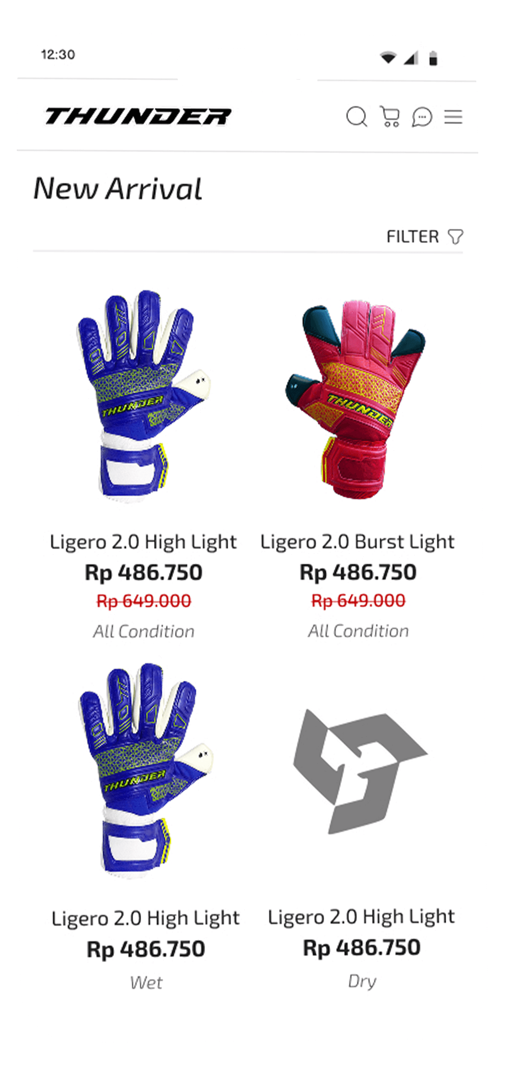
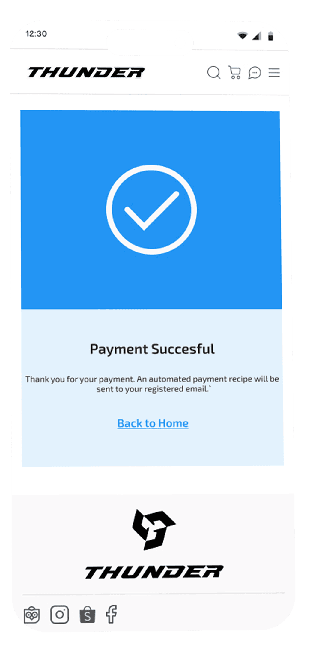
The UI was designed based on insights from early research. I focused on a minimalist yet elegant look, with intuitive navigation and time efficiency as key priorities. I took visual cues from local design trends—particularly the clean, structured interface style seen in brands like Compass—to maintain a modern and approachable aesthetic.
The UI was designed based on insights from early research. I focused on a minimalist yet elegant look, with intuitive navigation and time efficiency as key priorities. I took visual cues from local design trends—particularly the clean, structured interface style seen in brands like Compass—to maintain a modern and approachable aesthetic.
The UI was designed based on insights from early research. I focused on a minimalist yet elegant look, with intuitive navigation and time efficiency as key priorities. I took visual cues from local design trends—particularly the clean, structured interface style seen in brands like Compass—to maintain a modern and approachable aesthetic.
Registration Screen


Landing Page

Chat screen

Product screen

Detail Product screen

Transaction list

Filter screen

Menu screen

Cart screen

Tracking screen

Payment Screen

Basket Screen

Succesful payment
Registration Screen
Registration Screen
Landing Page
Landing Page
Chat screen
Chat screen
Product screen
Product screen
Detail Product screen
Detail Product screen
Transaction list
Transaction list
Filter screen
Filter screen
Menu screen
Menu screen
Cart screen
Cart screen
Tracking screen
Tracking
screen
Payment Screen
Payment
Screen
Basket Screen
Basket
Screen
Succesful payment
Succesful
payment

uSABILITY
TESTING
uSABILITY
TESTING
uSABILITY
TESTING
Due to time and location constraints, I conducted remote usability testing with 6 participants. This approach allowed me to gather valuable feedback efficiently while observing how users interacted with key features in real-time.
Due to time and location constraints, I conducted remote usability testing with 6 participants. This approach allowed me to gather valuable feedback efficiently while observing how users interacted with key features in real-time.
Due to time and location constraints, I conducted remote usability testing with 6 participants. This approach allowed me to gather valuable feedback efficiently while observing how users interacted with key features in real-time.
goal research
goal research
goal research

The UI was designed based on insights from early research. I focused on a minimalist yet elegant look, with intuitive navigation and time efficiency as key priorities. I took visual cues from local design trends—particularly the clean, structured interface style seen in brands like Compass—to maintain a modern and approachable aesthetic.
The UI was designed based on insights from early research. I focused on a minimalist yet elegant look, with intuitive navigation and time efficiency as key priorities. I took visual cues from local design trends—particularly the clean, structured interface style seen in brands like Compass—to maintain a modern and approachable aesthetic.
The UI was designed based on insights from early research. I focused on a minimalist yet elegant look, with intuitive navigation and time efficiency as key priorities. I took visual cues from local design trends—particularly the clean, structured interface style seen in brands like Compass—to maintain a modern and approachable aesthetic.
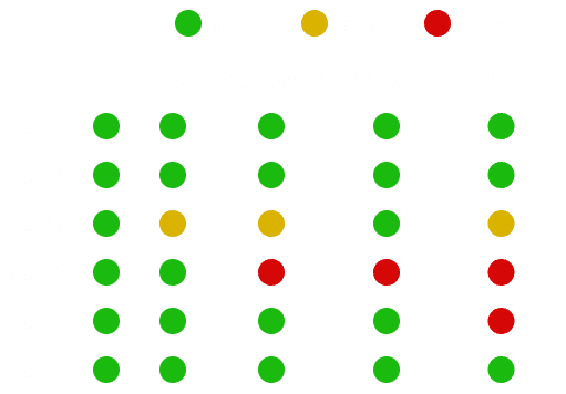
Task
Task
Task
1
Create Account
Create Account
Create Account
2
Send a message
Send a message
Send a message
3
Use the filter feature
Use the filter feature
Use the filter feature
4
Go through the purchase steps from
start to successful payment
Go through the purchase steps from
start to successful payment
Go through the purchase steps from
start to successful payment
5
Search for item tracking features
Search for item tracking features
Search for item tracking features

Solution
Solution
Solution
To solve the problems found during the usability testing process, I used a data-driven approach by combining two main sources: heatmap analysis and direct user feedback.
To solve the problems found during the usability testing process, I used a data-driven approach by combining two main sources: heatmap analysis and direct user feedback.
To solve the problems found during the usability testing process, I used a data-driven approach by combining two main sources: heatmap analysis and direct user feedback.
What works and what to improve
What works and what to improve

Analysis & Design Decisions
Analysis & Design Decisions
Analysis & Design Decisions
CHAT TASK
CHAT TASK


1 out of 6 participants did not find the chat feature because it was not visible on the landing page. landing page. Meanwhile, the heatmap shows that the other 5 participants followed the flow well. well.
1 out of 6 participants did not find the chat feature because it was not visible on the landing page. landing page. Meanwhile, the heatmap shows that the other 5 participants followed the flow well. well.
Before
Before

After
After
After

Based on the combination of insights from feedback and heatmaps, I decided to move the chat feature to the top right of the landing page so that it is more easily visible and accessible from the start.
Based on the combination of insights from feedback and heatmaps, I decided to move the chat feature to the top right of the landing page so that it is more easily visible and accessible from the start.
Based on the combination of insights from feedback and heatmaps, I decided to move the chat feature to the top right of the landing page so that it is more easily visible and accessible from the start.
Analysis & Design Decisions
Analysis & Design Decisions
Analysis & Design Decisions
FILTER TASK
FILTER TASK
Before
Before
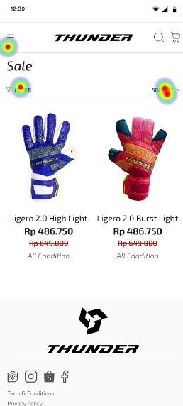
6 participants, 2 failed to use complete this task-1 skipped the task, 1 stopped the test directly due to frustration. Even though they were already on the appropriate page. The heatmap data showed most of the focus was on the right side, while the filter button was initially on the left.
6 participants, 2 failed to use complete this task-1 skipped the task, 1 stopped the test directly due to frustration. Even though they were already on the appropriate page. The heatmap data showed most of the focus was on the right side, while the filter button was initially on the left.
After
After
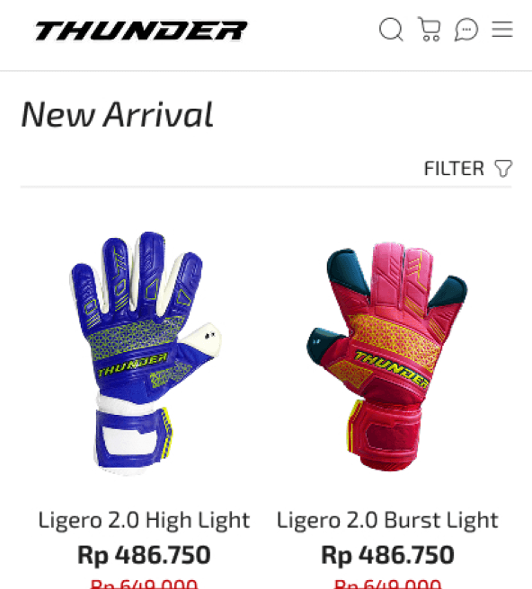
Based on these findings, I decided to move the filter button to the right and increase the font size to make it more visible. In addition, I also incorporated the "Sort by" feature into the filter to reduce the number of buttons and to simplify the interface, as both have similar functions.
Based on these findings, I decided to move the filter button to the right and increase the font size to make it more visible. In addition, I also incorporated the "Sort by" feature into the filter to reduce the number of buttons and to simplify the interface, as both have similar functions.
Based on these findings, I decided to move the filter button to the right and increase the font size to make it more visible. In addition, I also incorporated the "Sort by" feature into the filter to reduce the number of buttons and to simplify the interface, as both have similar functions.
Analysis & Design Decisions
Analysis & Design Decisions
Analysis & Design Decisions
TRACKING TASK
TRACKING TASK


Before
Before
In testing the tracking feature, 2 out of 5 participants failed to complete the task. One of the participants
participants gave feedback,
In testing the tracking feature, 2 out of 5 participants failed to complete the task. One of the participants
participants gave feedback,
"For order tracking, you can use "My Order" or something instead of "Transaction List", because I thought it was a cart, not my order."
"For order tracking, you can use "My Order" or something instead of "Transaction List", because I thought it was a cart, not my order."
Based on this feedback, I decided to rename the feature from "Transaction List" to "My Order" to make it more intuitive.
Based on this feedback, I decided to rename the feature from "Transaction List" to "My Order" to make it more intuitive.
Based on this feedback, I decided to rename the feature from "Transaction List" to "My Order" to make it more intuitive.

After
After
In addition, 3 out of 5 participants experienced problems when trying to click in this test-the the button did not respond quickly. Some ended up skipping the task, while others
kept trying until they succeeded. From the click tracking data, they actually clicked the correct button, so I concluded that this was a delay from the system, not from the design. Therefore, I kept the position of the button, only changed the name to make it easier to understand. easier to understand.
In addition, 3 out of 5 participants experienced problems when trying to click in this test-the the button did not respond quickly. Some ended up skipping the task, while others
kept trying until they succeeded. From the click tracking data, they actually clicked the correct button, so I concluded that this was a delay from the system, not from the design. Therefore, I kept the position of the button, only changed the name to make it easier to understand. easier to understand.
In addition, 3 out of 5 participants experienced problems when trying to click in this test-the the button did not respond quickly. Some ended up skipping the task, while others
kept trying until they succeeded. From the click tracking data, they actually clicked the correct button, so I concluded that this was a delay from the system, not from the design. Therefore, I kept the position of the button, only changed the name to make it easier to understand. easier to understand.
Conclusion
Conclusion
Conclusion
Combining Lean UX, Scrum, and Design Thinking in this case study helped me think more strategically, adaptively, and user-centrically. I learned that creating truly user-centered solutions requires structured and thoughtful processes. Although the result is not perfect, this experience was a meaningful step forward. By staying open to feedback and daring to try, Iʼve gained valuable insights—and thatʼs what drives me to keep growing. Moving forward, I aim to enjoy the process more and continue crafting solutions that truly meet user needs.
Combining Lean UX, Scrum, and Design Thinking in this case study helped me think more strategically, adaptively, and user-centrically. I learned that creating truly user-centered solutions requires structured and thoughtful processes. Although the result is not perfect, this experience was a meaningful step forward. By staying open to feedback and daring to try, Iʼve gained valuable insights—and thatʼs what drives me to keep growing. Moving forward, I aim to enjoy the process more and continue crafting solutions that truly meet user needs.
Combining Lean UX, Scrum, and Design Thinking in this case study helped me think more strategically, adaptively, and user-centrically. I learned that creating truly user-centered solutions requires structured and thoughtful processes. Although the result is not perfect, this experience was a meaningful step forward. By staying open to feedback and daring to try, Iʼve gained valuable insights—and thatʼs what drives me to keep growing. Moving forward, I aim to enjoy the process more and continue crafting solutions that truly meet user needs.
let’s
let’s
let’s
collaborate
collaborate
collaborate
good collaboration will bring rapid progress in the future
good collaboration will bring rapid progress in the future